
Let’s set aside technical considerations and just explore a few unorthodox data visuals. Why? Because doing so helps us to reward viewers eye’s and brains. At work, our eyes and brains are often forced to slog through repetitive logic and boring visual symbols that leave us uninspired, but an interesting visual can nudge us in just the right way. As important as it is that visuals make logical understanding easy, it’s also important to freshly engage our viewers’ brains with the occasionally whimsical visual, or perhaps one that is momentarily challenging, but then resolves into “Ah, I get it!”
Here are some very simple visuals I built from Tableau’s SuperStore, and they accomplish just that. We’ll look at four and consider their relative strengths.
Word Cloud
When a viewer is visually browsing many things, and is expected to be more, shall we say, hyped, on some things than others, a word cloud is a way to lure the distracted viewer onto an item of impulsive interest. To reward the viewer’s initial click, add a tooltip with facts or a link to a more informative presentation. More primal than informative, word clouds either do, or don’t, grab a viewers attention, depending on the words. (Admittedly, these shown are non-earth-shattering).
Tree Map (aka Heat Map)

This viz, more logical than inspiring, is effective for a viewer who wants first to observe sales across regions, to then see the exact sales in many of the leading lines, and then maybe compare a line against others within or across regions. Usage of screen-space is very efficient here, with plenty of room for text labels in most leading countries. On the downside, the overall visual effect is sleep-inducing. Okay, let’s wake up…
Bubble Chart
Bubble Charts reward viewers’ eyes with a pleasantly non-linear visual but relatively informative presentation. If you need something that says, “relax”, this may be it. The bubble sizes and text labels make comparisons across regions easy, but in exchange for the non-linear circles, we end up with less room for explanatory labels than we had with the Tree Map. If the non-linearity is initially intriguing, it never really rewards the viewer for doing sustained analysis at the country or regional level. Additionally, the packed circles amid the meaningless white space decreases the potential for information.
Common Features:
What do each of the above visuals share in common? Whereas most data visualizations rely heavily on columns and rows, these ones have neither, relying instead on size, color, lable and mostly arbitrary relative position. But, what if we add some structure?
Trending Tree Map
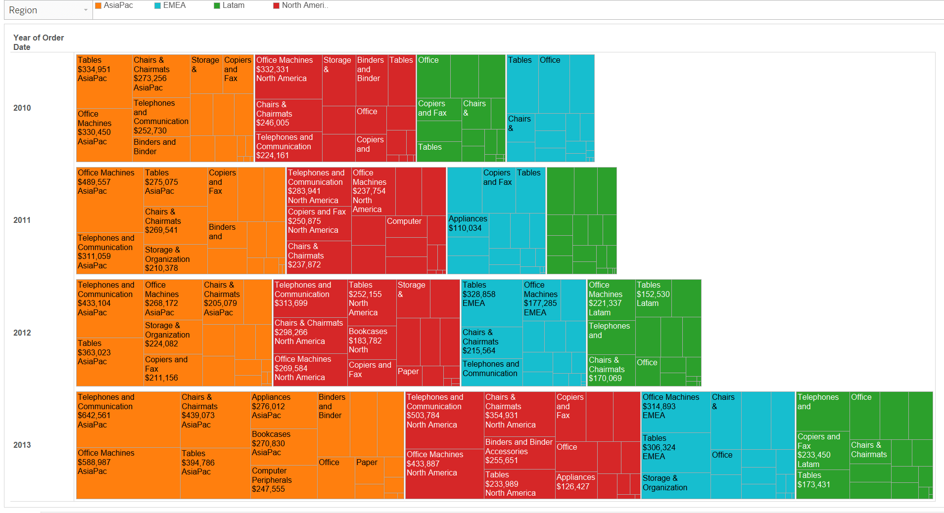 Here, using the Tree Map, I added the Order Year dimension to the Rows axis, and it pays off. Aesthetically, it is now more interesting. Logically, it communicates more information while remaining readable. As such, it rewards both the eye and the brain of today’s viewer. If the goal is for a viewer to pause, wonder for a moment about the intriguing presentation, quickly get the idea, visually scan around with interest in the relationships and then sit back and very easily observe both detailed and broad changes over time, then this visual does the trick.
So, insofar as I say this last one is more effective for more viewers than the others, but is also more logical and left brain than the others, is there really any value in right brained visuals? Yes. When we dashboard designers remain in a rut by starting all visuals by dragging primary dimensions onto axes, we risk ending up with yet another line or bar chart that is understandable but not rewarding. If, instead, we start out with a more right-brained approach as I summarized here, and then tweak it to be more informative, we can easily end up with some very unique visual presentions, at least one of which your next customer is going to love.
