One of my goals in this series on AWS Serverless Analytics has been to demonstrate how Amazon Quicksight allows us to build, share, and secure data visualizations and reports with minimal work associated with managing server hardware, operating systems or applications. In previous entries, I have explored AWS Glue, S3, Amazon Athena and, at a high level, Amazon Aurora. With this entry, we have those answers about Quicksight.
Because some readers here will be more interested in seeing the visuals themselves, and perhaps in a summary of my overall findings, I will intersperse screenshots of visuals and comment on them throughout this entry, and I will begin the entry with a summary of my favorite features and some takeaways. From there, we will go deep into the Quicksight service, exploring most of its features carefully without trying to cover everything. After reading this entry, you will understand what Quicksight is capable of, and even how to go about accomplishing it. With your own sample data set, you can use this guide to build a set of visuals, dashboards, and presentation stories and share them with colleagues.
Readers who are proficient with a leading data visualization tool such as Tableau, but unfamiliar with Quicksight, will likely want to decide how well Quicksight stacks up. For you readers, rest assured that Quicksight, released in November 2016, is no more mature than many other products under four years old. It lacks a whole raft of visual sophistication that Tableau developers, for example, rely upon to transform complex data into beautiful visuals that can get demanding customers smiling. Having said that, the fact that Quicksight is completely serverless in AWS is a pretty big deal in itself. No management of hardware, operating systems, applications. Click here for my recent introductory post on AWS Serverless Analytics: The Promise. No more application ‘version-upgrades-as-projects’. It’s nicely integrated already with Athena, Redshift, AWS Glue, has some out-of-box functionality with AWS SageMaker for visualizing machine learning, and is purpose-built to embed into other apps built in AWS. So, knowing about Quicksight is a good idea.
The visual below is called a Donut. While I will show dark-themed visuals, all Quicksight Visuals are also available in lighter out-of-box themes, and custom themes can be built, as well.
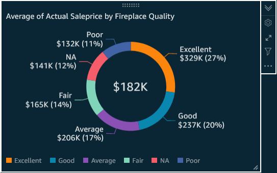
All by itself, the above visual is informative, easy on the eye, and fairly compact.
Favorite Features
Ease of Use: In addition to the inherent and import ease-of-use advantages of being a managed service, Quicksight is also easy to build on.
Price: It looks very affordable, with the notion that Amazon does not need to charge too much for Quicksight when usage usually entails the charge-able consumption of other AWS services, as well.
Integration with Athena and Connectivity: Being integrated with Athena is a big deal in multiple ways. Because Athena can, via the AWS Glue Catalog, query an S3 data lake, and because Quicksight can leverage Athena and, essentially view the Glue Data Catalog, Quicksight users can thereby easily build and share visualizations sourced an S3 data lake. Because Quicksight also leverages Athena workgroups, Quicksight users can also belong to teams in which access is easily managed, computational limits can be placed, and costs can easily be allocated teams based on usage. As we will demonstrate, Quicksight also has plenty of named connections to services within, and outside of, AWS.
Shared Data Sets: When a power user builds a good Quicksight data set that gains confidence among users, sharing it for use by others is, all by itself, an important step towards managed analytics. If a single data set brings in the right data, quality-checks it, and enhances it with accurate calculations, it makes sense to share it. It also saves dollars by preventing duplicate data computation and storage.
Administration: Quicksight’s high-level user-permissions can be managed without heavy ongoing configuration of Amazon’s Identity and Access Management (IAM) or Lake Formation services. This is in keeping with the notion of managed self-service analytics, wherein a business process owner, rather than a systems administrator, may perform routing administrative tasks regarding which users or groups can access what data, and who pays for usage.
Stories: In preparation for an important data presentation, having a pre-built story so that we can easily walk through an analytic narrative of any length and without the complexity of memorizing every necessary change, and simply clicking ‘Next’, ‘Previous’, ‘Next’, is a win. Think of it as a PowerPoint deck driven by live data from your browser. Because the Stories feature is available not just to licensees of a desktop-based visualization design application, but rather to any web-user with analysis authoring permissions, it is also another good democratizing feature for analytics.
Dashboards: This is one more way in which Quicksight supports managed analytics and self-service. Many information consumers simply need, as a Dashboard Reader (vs. analysis author) to be able to view visual information, maybe drill down, maybe filter, and to do it at low cost and hassle-free. If one such Reader gets authorization, she can receive ‘Create Analysis’ permissions, and thereby do some powerful things. Specifically, the user, on opening a dashboard, can now elect to save it as a separate copy of an Analysis, leverage the data set, the curation, the calculations, and the visuals or go ahead and enhance it by build more of any of those items. Beyond that, the Dashboard-reader-turned-analysis-author can now also build out Stories for presentation.
Themes: Some information consumers, myself included, appreciate visually dark themed content as an eye-relaxing alternative to ubiquitous background white-space. Quicksight provides it and supports custom themes, too.
Calculated Fields: Quicksight has a large library of functions to manipulate numbers, strings, dates, and establish conditions. The
Filters: These can be built either in the data set itself, thus effecting all analyses that use the data set, or within one analysis, such that it is limited to the analysis. Relationships between filters can also be configured for ‘AND’ vs. ‘OR’ to support various requirements for conditionality.
SPICE: Quicksight’s data extraction engine will provide fast query performance in situations when a direct query, for reasons good, bad, or indifferent, does not.
Limitations and Potential
Others will surely set up feature by feature comparisons of Quicksight vs. other products, but my purpose here is to dive into Quicksight and see what can be accomplish with it. I do see a number of limitations that, one hopes, will be addressed soon, and I’ll specify a few here. SPICE, Quicksight’s data extraction engine, does not, when used for a data set, allow manually sorting on dimension values as of this writing. This SPICE limitation, in conjunction with Quicksight’s lack of calendar automation features, means that when using SPICE, ordering months, for example, by calendar sequence rather than spelling requires the use of calculated numeric fields and the thereby calls for the compromise of displaying of a month number, for example ‘1’ or ‘2020 – 1’, instead of a name like ‘January’ or ‘January 2020’. Beyond dates, the inability to display a string field in a header, yet order by a sequencing integer, is a more general limitation. On another note, Table calculations exist, but are available for use only in pivot tables as of this writing. The use of Color, although it can be manually edited cell by cell, is relatively static and thus far from its potential as visual indicator. These are just a few limitations I encountered, but I will limit criticism to the above issues.
Even with visual feature-immaturity, Quicksight represents a major paradigm shift in data visualization simply because of its underlying serverless architecture as a cloud-native managed service, distinguished from a traditional application to instantiate on a cloud-based server. If, as a new product, it provides even a portion of the capabilities of an industry leading visualization tool, which it indeed does, then those with a ‘cloud-first’ mindset – meaning an instinct to ask early on “What does the cloud offer with unique value for solving this problem?”, Quicksight is a product to consider for some situations now and is certainly one to watch as it matures. The reality that each new feature enhancement can automatically be made immediately available to all licensees removes the complexity of licensees having to manage visualization software version upgrades as projects.
Pricing as of this Writing
In general, pricing looks very reasonable. Note, that, of course, SPICE is not free, and that AWS charges obviously also occur when a Quicksight query causes charge-able computing on another service like Athena, Redshift, RDS or S3.
Standard Edition: No reader role(s). For individual, or a team trial…
- 1 free author – no expiration
- 4 free authors – 60 day trial
- $12 / month / additional author after 60 days, so an extended trial can remain inexpensive
- Adding a single Readers role requires upgrade to Enterprise
Enterprise Edition: For a team. Or, for one author sharing with a few Readers
- Free Authoring: Same as Standard
- 1 free author – indefinite term
- 4 free authors – 60 day trial
- Additional Roles: Reader (interactive data consumer)
- Readers pay max of $5 / reader / month.
- Active Directory integration, in addition to open security standards described below
- Row-level security
- Nice feature, reducing the complexity for sensitive data.
- Data encryption at rest
Both Editions support…
- Spice (data extract):
- 10 GB / paid user at no charge
- Above 10 GB, pay per volume stored per month
- Single sign-on w/ support for these open standards
- SAML: Security Assertion Markup Language
- OIDC: Open ID Connect
Quicksight Pricing for Author-users
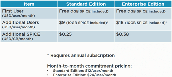
For pricing details and updates, see Quicksight Pricing Documentation
Quicksight Visual Development Process

Create account, connect to data sources, prepare data, and analyze data.
Core Components
Quicksight Account
Even if you already have access to an AWS account, building a first solution in Quicksight requires creating a Quicksight account. This makes sense considering that, within a potentially large base of Quicksight users, especially readers, the majority may have no need for other AWS permissions, so Quicksight’s own user-access permissions administration is a convenient place for either a dedicated Quicksight administrator, or perhaps a business process owner to perform user-access administration without requiring much involvement in IAM (AWS Identity and Access Management) or AWS LakeFormation.
Now that we have navigated to Quicksight in the AWS console, chosen a region, and entered feature-preferences, notice and click, at the end of the account sign-up process, the prompt ‘Go to Quicksight’. Consistent with the idea that Quicksight Reader-users may not need additional AWS permissions, note that our URL is now outside of the AWS Management Console, as in this URL comparison:
- Quicksight: https://us-east-2.quicksight.aws.amazon.com/sn/start
- Athena: https://us-east-2.console.aws.amazon.com/athena…
Once the Account is set up, the main screen looks like the screenshot below
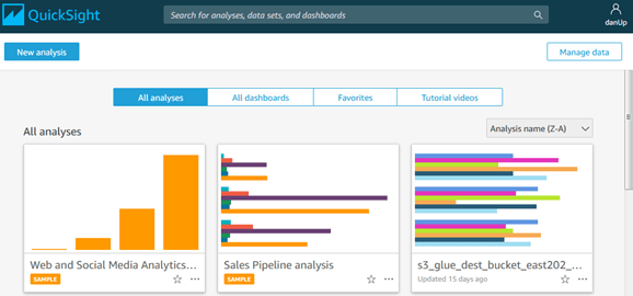
In the above screenshot, notice…
- Top Section: Search for analyses, data sets, and dashboards
- A choice of default view and sorting: All analyses, All dashboards, Favorites, or Tutorial videos
- Manage data: When clicking here, we will see existing data sets and can create news ones
- Choosing ‘Upload a file’ will load it as into SPICE as an extract
Before we begin connecting to a data source, let’s first look, at the account level, on what access Quicksight will have to other AWS Services, as shown in the screenshot below.
_________________
Quicksight access to AWS services:
To get to the page in the screenshot below from the Quicksight console, click in upper right on Username / Manage Quicksight / Security & permissions. If you see this screenshot, you can skip down to the next paragraph below. If you instead get a prompt to ‘Change to Region [x] to access permissions, etc.”, just click again under Username, find Region, change it as recently prompted to Region [x], then continue.
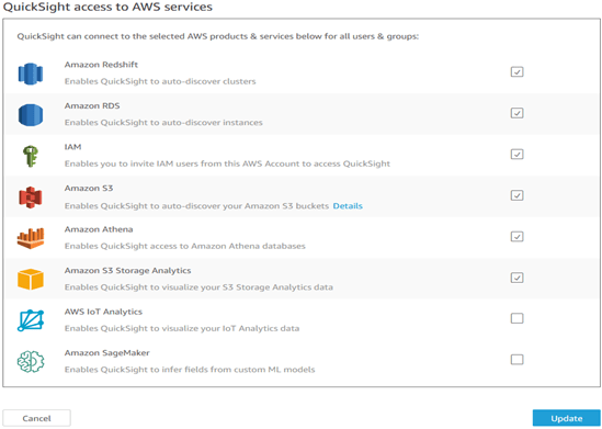
Once on the Security and Permissions page, after browsing a little, look under Quicksight access to AWS services, click ‘Add or remove’, and you should encounter a page like the above screenshot. Notice that, except for S3, access to the other AWS systems here is simply checked or not. So, after checking the appropriate services above, looking at Amazon S3, click on Details / Select S3 buckets, and we will see something like this…

Notes…
If you do not check the specific S3 bucket you intend to grant access to here, Quicksight will still allow you to set up your connection, for instance to Athena (with the intent to pull data from that S3 bucket via an Athena query), but Quicksight will throw an error when we try to return any data records, as it has not been authorized.
For Quicksight to support Athena Workgroup Associations with Athena Datasources (S3 buckets), then you must also check ‘Write permissions for Athena Workgroup’, too, on specific buckets. Amazon announced Quicksight support for Athena Workgroups here, and detailed documentation on using Athena workgroups is here. With this integration with Athena, Quicksight users, like Athena users, can be managed in terms of exactly which datasets they have access to, how much processing their workgroup is allowed to execute, and for understanding and allocating the costs of processing among workgroups. As with Athena, this use of workgroups feels like a solid approach to enabling managed self-service analytics, instead of chaos, the ever-present alternative. With that, let’s move on.
Connect
Configure and use a variety of data sources.
Data Sources: As of June 2020, the available data sources are shown here.
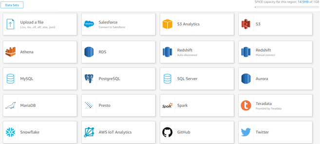
In the upper-left corner, ‘Upload a file’ means load data into SPICE, Quicksight’s data extract engine. More on SPICE below. For the remainder, any Quicksight data manipulation causes a direct query on that data source. Lots of choices to be sure. Besides Athena, it’s also great to see Presto, RDS, EMR, Redshift, some leading on-premises RDBMS, plus Snowflake, and Salesforce. Details on supported data sources, including some not highlighted above, are here.
SPICE Datasets
SPICE is short for Superfast Parallel In-memory Calculation Engine. It is Quicksight’s engine for on-demand or scheduled data extracts into an in-memory, compressed columnar repository, ensuring that Quicksight query performance does not lag due to slow direct queries against other datasets. SPICE’s size maximum is a healthy 100 million records per dataset. For other data sources, SPICE is optional, except… all ad-hoc flat file uploads directly into Quicksight will be stored in SPICE. Data extraction in visualization tools is both popular and expected, and a product that lacks a capable one may be a non-starter. The extract-for-performance argument is compelling, with some major caveats:
For visual or reporting query performance, upstream data optimizations can also be made that will accelerate direct query performance, and depending on the amount of data extracted, do so with less data duplication and at lower cost. A set of optimized files (tables) in S3 available via a Quicksight Athena SQL connection may suffice. Of course, these optimizations cannot always be done by those who need improved query performance immediately.
To the extent that Quicksight’s upstream data repositories are being updated frequently, data extraction into Quicksight involves a tradeoff between two negatives.
- If data extraction frequency into SPICE is less frequent that upstream data updates, then Quicksight users will experience more latency between an event and its appearance in a Quicksight visual.
- If SPICE extraction frequency is increased, then Quicksight becomes yet another data repository to refresh and manage, try to minimize data duplication in, and to pay more for, instead of simply being a simpler, more real-time, data visualization service.
For a little eyeball break, the next visual is a Bubble Chart, which is a color histogram with an added size factor

Histograms are unique, because they harness the human eye’s instinctive comfort with position. Bubble charts are potential more powerful in that they also size and color, which we also natively understand. As the wells show at the top, we have quantitative measures in both axes. We have added color and, to make it a true bubble chart, size, too. Note also the pop-up when I hover over the center data point. While the one shown here is far from brilliant, histograms in general are very useful for visual exploratory analytics. With that, back to data preparation.
Data Preparation:
Although you do not need to, if you want to click along with me in the Quicksight console, feel free. From the main console, we click, in the top right, ‘Manage Data’, then ‘New dataset’, then I will choose ‘Athena’, AWS’ managed service for SQL querying an S3 data lake. Enter a data source name (I just entered a dot). As long as this field is not blank, this entry matters little if you are using Athena in the same region as Quicksight. Next, click Validate Connection. Then, click ‘Create data source’, then choose our Athena database, we see something like the screenshot below.
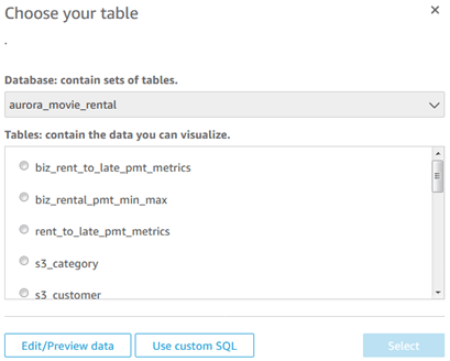
Now, I choose a table, and click ‘Edit/Preview data’, and then see the following screenshot.

I will now join to another table by clicking ‘Add data’. After choosing a second table, notice in the screenshot below that I have manually entered the join fields and selected Left join, because I want to see rentals even if no payment was made.
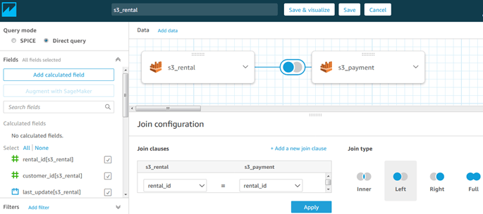
Note also the ‘Add a new join clause’ prompt in which we can create a multi-field (composite) join. If we need either a cross-join or a non-equi-join ( <, >, not = ), we can write them in a custom SQL query.
What follows are examples of important data preparation tasks. Going forward, note that I will use various data sets.
Calculated Fields:
Building them here during data preparation, instead of later during the creation of analyses, has the big advantage of making them available as common calculations for all analyses using the same data set. Function categories include aggregates, date functions, conditional functions, math, numeric functions, string functions, and for use with Quicksight pivot table visuals at the time I’m writing this, table calculations. Notably, calculated field functions are case-sensitive, so we will stick with the case shown in the Function list
For calculations documentation, see Quicksight Functions by Category.
Hands on Calculations
I will demonstrate a few calculations below to familiarize you with the interface. From the page in the above screenshot, clicking ‘Add calculated field’, the display looks almost like the following screenshot.
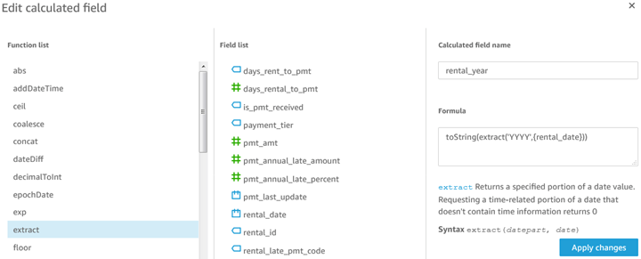
Instead of showing a blank calculation form for adding one, the above screenshot is for editing an already-built one, which I will describe here. The visual layout is straightforward. Single-clicking a function, then a field, brings them into the formula window, with a helpful reference just below. In the above calculation, named rental_year, I took rental_date, a date-time field, used the date extract function to pull just the year, then I converted the output to a string, because next I will perform string concatenation with it. Before the string concatenation, however, I also built a ‘rental_month’ calculated field using nearly identical logic, using ‘MM’ instead of ‘YYYY’, which we will also use.

This calculation scripting demonstration serves two purposes.
- Like most visual developers, I often want to group date information by months or years, rather than just by individual dates, the rental_year_month calculated field will accomplish that while allowing for correct sequencing of months along an axis, instead of April (A) appearing before March (M). As Quicksight currently lacks date automation for this, we will build calculated fields ourselves.
- As I demonstrate here, calculations are easily built on other calculations
Conditional Calculated Fields
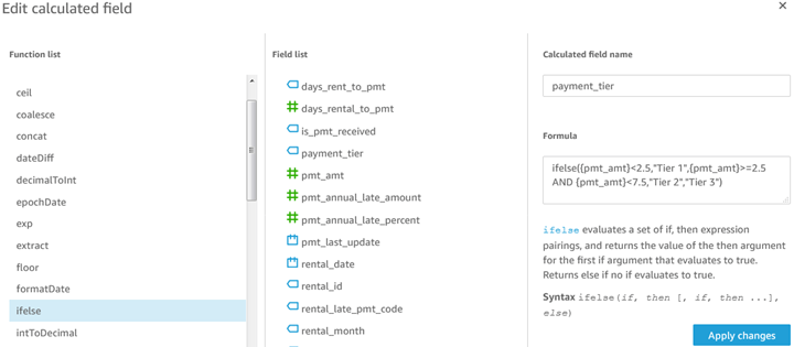
The payment_tier field demonstrates simple math operators and an If Else condition. Note the unique syntax of ifelse().
Data Set Filters
As with data set calculations, the data set filters, and their chosen values, are applied to all analyses that use the same data set. Data set filters are therefore a tool for data management, including self-service analytics management in that they help to create common data sets from which multiple analyses are possible. If, however, one analysis using this data set should have these data set filters as fixed constraints, but another analyses using this data set do not, then the data set filter should be removed, and it can be setup identically only within the analysis that needs that fixed constraint. In this way, the data set retains its value for use in multiple analyses.
After looking at calculation scripts, it’s time for another visual: Here is a Heat Map.
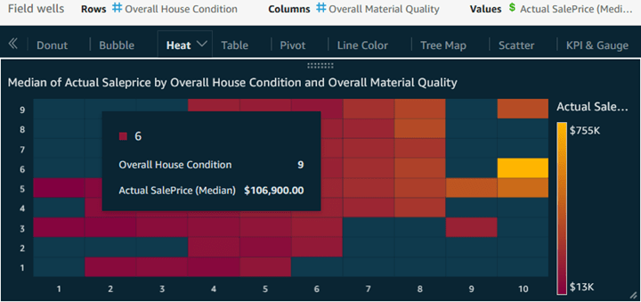
Heat maps, leveraging only position and color, are essentially histograms for a more right-brained analysis. As is the case with histograms and bubble charts, heat maps leverage the fact that we tend to unconsciously consider ‘upper’ to be better than ‘lower’, so in this heat map, we place measures with higher numbers indicating better. In this case, I decided, for the x axis to make ‘right’ mean better than ‘left’, but this choice is only a subjective preference. From there, we use colors, which either instinctively, or at least with a good legend, also indicate better vs. worse, as we see here. Heat maps are largely about exploratory analysis, or for coaxing an information consumer in with an intriguing display needing some random mousing over, and the pop-up cell rewards it with an the exact median price for that combination of house condition and material quality ratings.
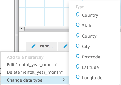
Geospatial Data Preparation
Quicksight has some built in geospatial mapping capabilities. For Quicksight geospatial documentation in AWS, see Adding Geospatial Data. The screenshot below shows the out-of-the-box geospatial data types that may be assigned to a field in our dataset.
An example of a map visual from Quicksight documentation is shown below.
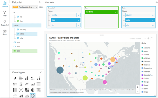
Notes on the above screenshot:
- Measure: In this case ‘population’, depicted as the size of the circle.
- Colors: Perhaps a better, choice here would be a segmenting dimension field like age-group or gender.
- Geospatial hierarchies were built and placed in the Geospatial well (box): Hierarchies not only allow for user drill-downs, and also provide a simple means of disambiguation of duplicate geographic names, such as identically named townships in multiple counties or states, as described below.
Hierarchy: State County Township
Iowa Cedar County Springfield
Iowa Kossuth County Springfield
Michigan Oakland County Springfield
Latitude and longitude may together be placed as the lowest level (leaf) member of a hierarchy. For the Quicksight latitude / longitude data types, the decimal format is supported, for example: 26.2373355-4.7192365. The following common format is not supported: 26°23'73.0096''N 84°71'92.2424''W
Sharing Data Sets
For the benefit of, among other things, self-service analytics, Quicksight’s shared data sets empower more people to leverage a common, prepared Quicksight data set for different purposes. Subsequent changes made to a data set automatically propagate to shared users, which we know all too well does not occur with emailed spreadsheets.
Those becoming users of a shared data set must have Quicksight account access, either by being an IAM user in AWS, a Quicksight-only user, or for Enterprise edition, a user in Active Directory. The base permission level for a shared data set user is named just that, ‘User’, in which she/he can view and create analyses (visuals, pivot tables, or simple tabular reports. A higher permission is named ‘Owner’, in which the user has user-level rights, plus the ability to modify, refresh, delete analyses, and to grant and revoke user access. Initially, only a data set’s Author has Owner permission. The shared Owner paradigm is consistent with managed self-service analytics insofar as the author of a data set can delegate administrative responsibility to a business process owner.
Hands on: Sharing a Data Set: From the Data Sets page, select one, then click Share. Next, search by email for a user, click Share, and select either a permission level of Owner or User.
Analysis
A new Analysis page looks like this:
Notice the following in this screenshot:
- In the upper bar, the Analysis name. An Analysis will evolve during development, and whenever we arrive at any task-completion milestone, we should will want to assign a versioned name, like Home Sales v0.2, so we can revert to it later if we end up breaking something with new coding. Autosave, the default, is a good choice here, but does not version the name.
- Just below that, once we have a useful visual, we should add a descriptive sheet name, as well.
- Looking in the far left pane, we are on ‘Visualize’, effecting what appears in the next pane to the right.
- In the field list, measures have green icons and dimensions have blue icons.
A publishable Quicksight analysis includes a visual, an analysis (a container), and may include a dashboard and a story, two optional containers.
Visual: In summary, a visual is a chart, geospatial map, gauge, KPI, table, or pivot table
Containers
Analysis: It contains one or more visuals displayed for shared authoring and management on one canvas, multiple canvases accessible via tabs, and on any tab, may extend beyond the viewable screen and require scrolling.
Dashboard: A copy of an analysis, saved especially for read-only usage by Reader-level users, affording automatic updates from refreshed data, drill-downs, editable colors, and ad-hoc filters that are not saved beyond a session.
Story: A series of captured analysis iterations, herein called scenes, offering presentation of a progression of visual analyses towards an important finding or conclusion. The fact that these stories are available to be built by shared users (not just owners, or just the few licensees of some data visualization design application), indicates yet another way in which Quicksight offers a unique product feature supporting managed self-service analytics, which helps democratize the sharing and nuanced presentation of data insights based on a common, curated data set.
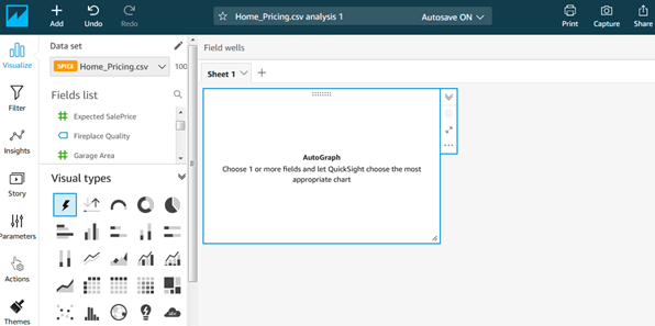
Note that each visual pulls data from one data set. Also, based on a set of highlighted fields, an AutoGraph feature exists that infers and builds a potentially useful visual. It may be far from what is desired, but it might kick-start the most left-brained among us to begin thinking about potential visuals. Have fun if you want, but avoid relying on AutoGraph as a substitute for learning to build visuals from scratch, which is pretty easy, too.
Time for another visual. This one is a Tree Map, which is similar to a Heat Map

A tree map may be even more exploratory and right-brained than a heat map. The primary measures here is always size, with a secondary measure as color. In tree map implementation here, although I did not configure it as such, larger (better) values are automatically moved to the upper left, and smaller (worse) ones are fitted below it and to the right. The Group By means ‘aggregate into one rectangle’. Shape is meaningless, used here so the whole remains a rectangle. The pop-up, as always, provides detailed findings as a payoff for mousing around while exploring the visual. With that, onward to considerations for setting up these Quicksight visuals.
Visual Details:
Dimensions and Measures: While the data set might do a reasonable job of automatically assigned each field as either a dimensions or a measure, we definitely should check them initially, and then refine them, as well, as we prepare the data set. For example, a product ID with an integer data type would never be operated on mathematically and is not a measure, so if it is needed in a data set, it should be changed to dimension.
Creating Visuals:
Choose a Visualization Type. In the above visuals screenshot’s lower left section, we find these types: AutoGraph, KPI, gauge, donut, pie, bar charts, stacked bar charts, stacked 100% bar charts, line charts, combo charts (area + line, bar + line, stacked area + line), table, pivot table (which can use table calculations), heat maps, tree maps, histograms, points on map, insights, and word clouds. So, first choose a visualization type, then drag fields onto the relevant field-wells that appear for that visual type (axes, color, and size).
I will soon show many visualization types, but first I need to summarize some capabilities.
- For sorting items on axes:
- Manual sorting, like with day of week, is available with direct-query data sets, but not in SPICE. As such, as I describe in detail above, calculated fields are the way forward for improved sorting from SPICE.
- For dimensions:
- They can be sorted by dimension values or by measure values (descending, for example)
- Drill-down: Once built, these function work for users as an all-or-nothing feature. After a drill-down, the previous visual level is no longer visible unless we click back and return to it.
- A drill-down need not represent a natural hierarchy. We could drill from worldwide by year down to one region by year, or we could build the drill-down the opposite way: drill from worldwide by year down to worldwide by month.
- For measures:
- From the left pane, right-clicking on a measure…
- Show as: (Number (1.25), Currency ($1.25), or Percent (125%)
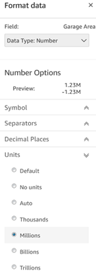
- Format: Many options here, including Units, as shown in the screenshot below.
- On the canvas, from a well (axis/shelf) with a field in it, right-clicking…
- Sort: Descending, ascending, or the if left alone, it will sort by dimension value
- Aggregate: Other options, of course, exist besides the default (Sum) will often needed:
- Sum, average, count, count distinct, maximum, median, minimum, percentile, standard deviation, standard deviation-population, variance, variance-population
- Formatting Visuals: To do this, from the canvas click the gear icon in upper right for the Format visual, and the following initial choices appear: Too many options to show each in screenshots.
Some of the interesting visual format choices are font choices, position of legend and on-chart data labels, axis as linear or logarithmic, axis custom range and step size, hide title (the analysis container can have a title).
Working in Analyses
An analysis, the primary interface object for sharing, contains between one and twenty visuals on one canvas, whether scrolling is required or not, for shared creation and management.
Analysis Filters…
- Have no effect on other analyses from the same data set
- Choose to apply each one to only one visual, a set of chosen visuals, or all visuals in the analysis.
- Can be originated by clicking either on the field in the left pane, as with data set preparation, or by clicking on the value-cell in the canvas.
- When multiple filters in one analysis are required, their relationship can be set as ‘AND’ or ‘OR’ to support complex conditionality rules.
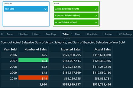
Table Visual: Any data visualization tool should be able to create tabular output, and here is a Table visual, with conditional formatting added for low and high annual sales counts. Notice how all three values were renamed to make sense here.
Working with Dashboards
- Notably, beyond a Dashboard’s read-only limitations, a user can create an Analysis from a Dashboard
- Dashboards are created from Analyses via ‘Share / As Dashboard’.
- While sharing as dashboard, we can click ‘Can create analysis’ checkbox so that, even if the shared users’ role is just a viewer, she/he can now create a new writeable version of the underlying analysis from this dashboard, and from there she/he can create a Story.
- Once checked, we are then prompted to confirm these user’s access to the Analysis’ data sources, or to abandon the change.
Viewing a Dashboard
- Viewers can drill down, save to CSV, change colors, and apply filters.
- Colors that are changed, and Filters configured here here have the same options as in an Analysis, but they do not revert to default values after each session.
- Save as: If dashboard user was granted the ‘Can create analysis’ right, then Save as (new analysis) appears in the upper right of the screen. This newly-created analysis has no effect on the original analysis underlying this dashboard.
Pivot Table Visual: The screenshot below shows a pivot table from a different data set on rental sales by year and month number on columns, and payment tier on rows, with both row and column totals and with subtotals selected only for columns. We also have a percent of total table calculation, calculated ‘Table down’ as the screenshot added immediately below it shows.
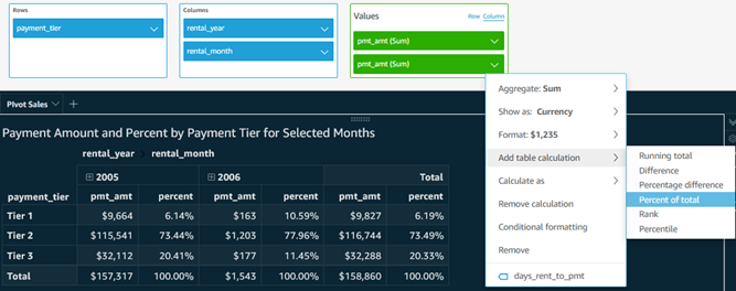
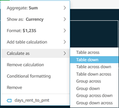
- Table Calculations in Pivot Tables are useful aggregate calculation tools. In the screenshot above, notice the choices for table calculation as well as whether it calculates down, across, both, or whether it groups cells. In our case, choosing group across would start the aggregation over for each year.
Quicksight offers basic pivot table functionality, and table calculations add some sophistication. As of this writing, however, pivot tables are the only place Quicksight table calculations are employed.
Stories
On clicking ‘Capture’ in the upper right of the screen on any number of tabs within one analysis, all of the tabs visuals are captured into one scene in the Story, including content that may be off-screen and require scrolling. From one captured scene in a story to the next, the change may be small, as with a filter that drills down or steps through successive months, or very large change for a quickly progressing narrative.
Hands on: Create a Story
- On a given tab in an analysis, set filters as desired for a story’s first scene.
- In the upper right, click ‘Capture’
- In the far left pane, if not already showing the Story, click on Story
- Name the Story
- Name the initial scene
- From the same, or a different tab, enter any desired filter values or other settings
- In the upper right, click Capture again.
- In the left pane, name the new Scene
- Repeat until the Story is complete.
- To view it, hover on any scene, click it.
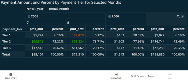
The screenshot below is a Story based on the Pivot Table previously viewed, both with that initial scene and a second scene as a simple drill-down showing months with some conditional formatting for high or low payment amounts.
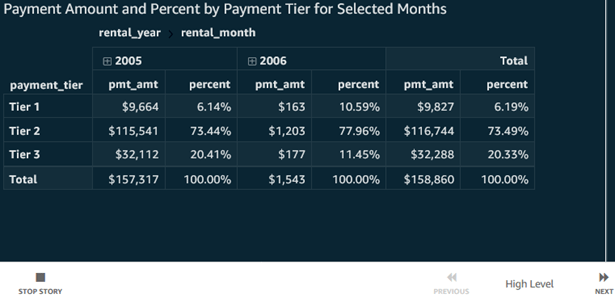
Immediately above, notice the simplicity: ‘Stop Story’, ‘Previous’ and ‘Next’ controls. When I click ‘Next’, we see…
Although the scene change here is so simple that, by itself, it does not justify creating a story, consider this: When a story has, for instance, a combination of minor changes like this, as well as more dramatic ones that support a specific analytic narrative, and maybe overall, a fairly long series of things should be considered, capturing all of these scenes, with small or large changes, into a simple …next, next, next… story is a great way to remove the pressure on an analyst presenting a lengthy, nuanced story from having to madly click around, changing filters, drilling down, moving to a new tab, and remembering each nuance, all while presenting at a quarterly meeting full of stakeholders who need a great summarization of insights. In this situation, nothing beats a Story, which can be presented as easily as a PowerPoint deck.
Stories being available and simple for any analysis author – for example a dashboard-reader user who creates an ad-hoc analysis from a shared dashboard – is a great democratizing feature that can help make presentations based on sound underlying data more of a routine capability for everyone.
Conclusion:
While I did not initially consider that this blog entry go this deep or be this lengthy, I wanted to carefully explore Quicksight, from the perspective of an experienced data visualizer and data solution architect at a deep enough level to discern what it does well, and I have done that. My evaluation and takeaways, as mentioned earlier, are at the beginning of this entry, and I won’t restate them here, except to say that, for the right needs, I will be happy to use Quicksight, and I look forward to seeing it continue maturing until it becomes an industry leader.
With that, I thank you, committed blog reader. If you gained something from this update, please like, share it with others, and drop a comment into my LinkedIn Activity Feed.
